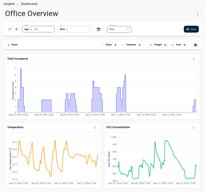
Each panel on a dashboard runs one or more computations on your data sources over the dashboard's time period and visualizes the results in a chart. You can build a dashboard by describing what you want to see to Neo, Neowit's AI assistant, or by defining the computations and charts yourself.
This article explains how to use a dashboard that has already been built, how to build one with the help of Neo, and finally how to build and fine-tune one yourself.
Creating a dashboard
Go to Insights and open the "Dashboards" tab. Here you see all dashboards in your organization, and you can search for a dashboard by name or delete dashboards you no longer need. All users in your organization can see and edit all dashboards.
Click "New dashboard" and give the dashboard a name. You can then either:
- Pick one of the suggested starting points, or describe what you want in your own words, and click "Build with Neo". Neo, the dashboard assistant, will open next to the new dashboard and start building it for you. See Building a dashboard with Neo below.
- Click "Start blank" to get an empty dashboard and build it yourself. See Building a dashboard yourself below.
Using a dashboard
The bar at the top of a dashboard holds the time span, timezone and the refresh controls. Below it is a toolbar for adjusting the grid, and then the grid with the panels. Each panel has a header with a name and an action menu.
The menu in the top right corner of the page lets you rename the dashboard or save a copy of it.
Time period
You can set the start and end of the time period using the "Start" and "End" fields. The dropdown at the left of each field selects how the time is given:
- At: A specific date and time of day, written as yyyy-MM-dd HH:mm, e.g. 2025-03-31 08:00.
- Now: The present time.
- Ago: A time offset before the present time, e.g. 6h, 2 days or 1w 3d. You can use years, weeks, days, hours, minutes and seconds, or the abbreviations y, w, d, h, m and s.
- In: A time offset after the present time, written in the same way as for "Ago". Will only show future data for computations where Forecast is enabled.
Times given relative to the present ("Now", "Ago" and "In") are recalculated every time the dashboard refreshes, so a period from 6h ago until now will always show you the latest six hours of data. If you instead want a fixed period, use "At" for both the start and the end, or click the calendar button to pick a date range. The calendar has shortcuts like "Yesterday", "Last 7 days" and "This month". Selecting a range sets the start to the beginning of the first day and the end to the end of the last day.
The timezone selector determines how the dates and times you enter are interpreted, how times are displayed in the charts, and which timezone is used by the data queries that filter on time of day or day of week. By default, the timezone of your browser is used. If you change the timezone, times given with "At" keep their date and time of day in the new timezone.

Refreshing
The dashboard fetches data when you open it. After you change the time period, click the refresh button to fetch data for the new period. You can also use the refresh button to fetch the latest data at any time.
The dot next to the refresh button shows whether automatic refresh is on (green) or off (grey). Click it to toggle automatic refresh. With automatic refresh, the latest data will be fetched automatically every 30 seconds. Dashboards with a fixed time period do not refresh automatically, since the data does not change.
Arranging the panels
Drag a panel by its header to move it to another position in the grid. If you drop it exactly onto another panel of the same size, the two panels swap places. Drag the handle in the bottom right corner of a panel to make it span more rows or columns. While dragging, the outline turns red if the panel cannot be placed there.
The toolbar above the grid adjusts the grid as a whole:
- Rows and Columns: Add or remove rows and columns. You cannot remove a row or column that has panels in it. Columns share the width of the page, so adding a column makes all panels narrower.
- Height: Change the height of the rows, and thus of all panels.
- Font: Change the font size used in all charts.

Panel actions
The menu in the top right corner of each panel has various actions, where the most common ones are:
- Edit Name: Change the name shown in the panel header.
- Download: Save the chart as a PNG or SVG image, at the size you choose.
- Show Query Data: Open the Query tool in a new tab, pre-filled with the panel's computations, data sources and time period. This is the easiest way to inspect or download the numbers behind a chart.
- Delete: Remove the panel from the dashboard.
The remaining actions, "Edit Computations" and "Edit Chart Spec.", are covered under Building a dashboard yourself below.
If something is wrong with a panel (an invalid computation or chart specification, or a failed data query), a warning icon appears in its header. Hover over it to see what the problem is, and click to make the details visible.
Saving
Changes you make to a dashboard are not saved until you click "Save". The button appears in the top bar as soon as there are unsaved changes and disappears again when everything is saved.
To keep the original dashboard and save your changes as a new one, choose "Save New" from the menu in the top right corner of the page. Choose "Rename" from the same menu to rename the dashboard; this is saved right away.
Presenting
Click "Present" in the action menu in the top right to enter presentation mode, where only the charts are shown and no changes can be made. Data will still refesh automatically if that is enabled. Click "Edit" to show controls and editing options again.
Building a dashboard with Neo
The simplest way to build a dashboard is to ask Neo, Neowit's AI assistant. It is available in the "Neo Helper" sidebar whenever you have a dashboard open: choose the Dashboard assistant in the sidebar and describe what you want to see. If you created the dashboard with "Build with Neo", the sidebar is already open and Neo has already started.
Neo sees the current state of the dashboard and can change every part of it: it can find the right devices and spaces in your organization and turn them into data sources, write computations, create and arrange panels, design charts, and set the time period and timezone. You can be as specific or as vague as you like, from "Occupancy by floor over the last 30 days" to "Make the temperature chart a bar chart and put it next to the CO₂ chart".
Changes made by Neo show up on the dashboard immediately, but they are not saved until you click "Save". This lets you look at the result, ask Neo to adjust it, or undo everything by leaving the page without saving.
Neo remembers your conversation for each dashboard, so you can come back later and pick up where you left off. Use the trash button at the top of the sidebar to delete the conversation history and start over.
Building a dashboard yourself
Behind every panel there are two things: a set of computations that produce the data, and a chart specification that determines how the data is visualized. Computations refer to data sources, which are shared by all panels on the dashboard. You can edit all of these directly, and you can freely combine this with asking Neo for help.
The Query tool article explains data sources and computations in detail.
Data sources
Data sources are defined once for the whole dashboard and can be used in the computations of any panel. Choose "Edit Data Sources" from the menu in the top right corner of the page to show the data source editor above the grid. It works the same way as in the Query tool. Choose "Hide Data Sources" to hide the editor again.
If a data source refers to a device, space, tag or sensor type that no longer exists, a warning icon appears in the top bar. Click it to open the data source editor and fix the data source.
Panels and computations
Click "Panel" in the toolbar above the grid to add a new panel. It is placed in the first free cell of the grid, or in a new row if the grid is full. A new panel comes with a default computation and a default line chart, so you only need to point the computation at your data. The trash button at the right of the toolbar deletes all panels on the dashboard.
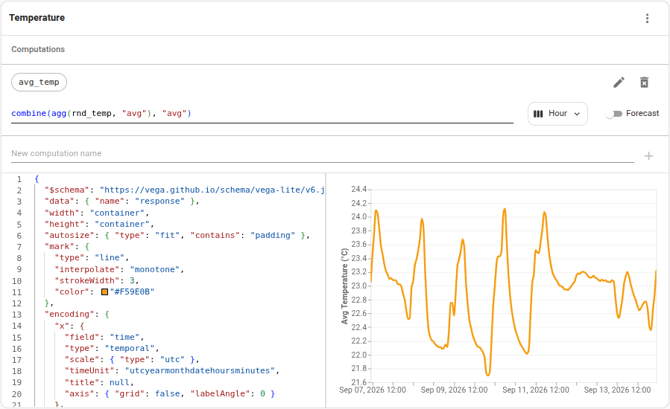
Choose "Edit Computations" from the panel menu to show the computation editor inside the panel. Each panel has its own computations, defined the same way as in the Query tool, and the results of all of them are made available to the panel's chart. Click the refresh button in the top bar to fetch data for your changes. Choose "Hide Computations" to hide the editor again.
Chart specifications
How a panel visualizes its data is determined by a chart specification written in Vega-Lite, a widely used format for describing charts as text. The specification says which kind of marks to draw, such as lines, bars or points, which parts of the data to use for the axes and colors, and what to show in the tooltip. This makes it possible to create nearly any kind of chart, but writing a specification takes some getting used to. If you would rather not, ask Neo to design the chart for you.
Choose "Edit Chart Spec." from the panel menu to show the specification editor inside the panel. The specification of a new panel has comments explaining what each part does, and you can hover over the fields in the editor to read about them. The editor checks the specification as you type and highlights any errors. Changes are applied to the chart when you click outside the editor.
The results of the panel's computations are available to the chart as a Vega dataset named "response". Each data point in it has the following fields, which you can use for the axes, colors and tooltips of the chart:
- time: The time of the data point.
- value: The value of the data point.
- queryExpressionName: The name of the computation the data point comes from.
- deviceName: The name of the device or space the data comes from.
- sensorTypeName: The type of sensor the data comes from.